Whites, Values, and Magna Doodle Drawings – Ryan Embry
Do you remember the Magna Doodle? It was a neat little plastic toy popular in the 1980’s, the decade of my childhood; a magnetic drawing board equipped with a metal stylus attached by a string. Its best feature was the eraser; a bright orange sliding lever situated below the screen. One quick swipe would completely clear the board, and just like that you’d be presented with a clean new “page” and a fresh start. It was magic! And as a kid, 4 or 5 years old, I would busy myself for hours sketching on the thing; dinosaurs, robots, animals, potato shaped people with giant noses… Oh, the possibilities! It was a glorious pastime, a gentle obsession, and an escape.
The trajectory of my exploration of the various art supplies and mediums will be familiar to most graphic artists and painters, and ultimately the beloved Magna Doodle was replaced by more sophisticated tools. There was graphite, pen and ink, watercolor, pastels, prismacolors (they were actually good back in the day, and didn’t break on you every 5 minutes.) Eventually I became curious about oil painting.
Oil paint was something altogether different: the medium of the Old Masters and, to my mind the pinnacle of the fine arts. Esoteric and intimidating, voluptuous and nuanced, the sirens call of centuries long gone, the alchemy and grit of ancient forgotten pigments and the tumult of history.
Naturally, I was hooked. There was something enticing about the butteriness of the paint, the smell of the linseed oil; vegetal and full- the fancy long handled brushes and all the strange and unfathomable tubes and bottles of resins, thinners, alkyds, extenders, driers and varnishes. Then there was the paint itself, a bewildering rainbow of hues and pigments. It was clear that I had an awful lot to learn.
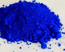
So let’s talk about paint. Specifically, white oil paint. White is perhaps the most essential color on the artists palette. Optically, the way we “read” an image is thru the perception of values – light and dark. It’s the reason why we don’t need color to understand and enjoy an old black and white movie, or to appreciate vintage photographs from the 1800’s. When it comes to paint color, white is the tip top of the value scale- you simply cannot get any brighter or lighter, making it optimal for the efficient creation of a painting.
Basic lead carbonate, or lead white was the practical white of choice for hundreds of years. From Jan van Eyck in the 15 th century to the impressionists, lead white was favored for its availability and relatively low cost and ease of production. Lead white also has the qualities of a quick drying time and a gentle transparency that makes it ideal for painting subtle flesh tones and applications of thin smoky glazes. Unfortunately it has been proven to be highly toxic when ingested, and poses well documented environmental risks. In the U.S. lead was banned for residential use in 1978. It is interesting to note that lead white, often called Cremnitz white, or flake white has made something of a modern day comeback, and many painters today love it for all the same reasons their predecessors did.
It was in the early 1920’s that titanium white became commercially available as an artists pigment. It is the brightest white, super opaque, non toxic and rather slow drying, especially when applied thickly. Many of the titanium whites on the market today contain zinc, which has come under considerable scrutiny for issues surrounding its propensity to cause brittleness, cracking and possible delamination in the paint layers… not so great.
All this problematic information regarding white oil paint, combined with its sheer necessity on the palette led me on a mission, a noble quest if you will, to find the “perfect” white. I needed something that combined the transparency, subtlety, and warmth of lead carbonate with the brightness and non toxicity of titanium, without the worrisome addition of zinc. Thru some research on various online art forums I was recommended to The ArtTreehouse, and their Treehouse White. It was highly praised in terms that sounded very interesting, by painters who seemed like they knew what they were talking about. So I ordered the 37ml tube and gave it a try.
After making a couple small paintings using the Treehouse White I emailed Robert, at The Art Treehouse, to give him my thoughts on their product:
“So I received your Treehouse White and have been painting with it. I gotta say, so far I really like it. It does indeed have that stringy, or “ropey” texture, that I find quite pleasing. It is a warmer white than my other titaniums, which is suitable for my applications. I used to paint with 2 whites; an opaque, and a more transparent flake white hue. Somehow this Treehouse White serves both purposes. When mixed in small amounts it doesn’t overpower, and has a noticeable transparent quality. When applied thickly, it covers well and can be opaque, I think now I can just use this one white on my palette, which is pretty cool! Will be purchasing the
larger tube soon I think. Thanks! Love it!’’
I would recommend The Art Treehouse and their products to anyone who is serious about oil painting. The world needs art, and artists need quality materials. I feel that the standards of care and craft we put into our painting is shared by this company, as well as many other small operations across the country. It’s a symbiotic relationship that needs to be cultivated, supported and nourished.
On technique and materials:
Regarding technique, the methods will vary somewhat from one painting to another. It depends upon scale, (the actual size of the painting) subject matter, time constraints, and frankly, whatever mood I happen to be in. For instance, when attempting to capture a specific likeness in a portrait, proportion is absolutely key, and a highly accurate drawing will usually be the first order of business. Conversely, if I’m going about a landscape, a study of sky and clouds, flowers and other plants, ocean waves or a still life I may omit a preliminary drawing altogether and just jump right in with paint, usually with some thinned down raw umber. I’ll “draw” with the paint using mostly straight lines and gestural marks, big shapes of light and dark. During this preliminary stage- the block in, it is important to keep a clear and distinct separation between the light and dark shapes. You really want to avoid any detail at this point in the process- that will all come later. You will inevitably have to make corrections in your drawing, and if you keep your shapes and lines simple, then so to will be your corrections. Painting is hard enough, so be kind to yourself and keep it simple. Once you get everything where you feel it should be, and things are looking good, put the brush down! Take the dog for a walk, drink some coffee, do the dishes, have a beer, whatever… take a break and step away from the easel. When you come back to your painting, use a mirror to view it in reverse. This will enable you to see things from a different perspective, and any major mistakes or weirdness should jump right out at you.
I almost always work on a toned canvas, known as an imprimatura. This provides me with a transparent mid-toned ground, upon which I can more accurately calibrate both my light and dark values. I’ll mix a combination of raw umber and burnt umber, thinning it down a little to achieve a fluid, inky consistency. Using a large, stiff bristled brush I can then scrub this mixture onto the canvas, establishing an even coverage across the surface. Next, I can take a blue shop towel and massage the paint into the surface, ensuring a soft unified tone, while also removing excess paint. What you will then be left with is a warm, middle value surface, perfect for our subsequent applications. A fun and effective method to employ at this stage, before your imprimatura dries too much, is the “wipe out” technique. You simply take a rag, or a clean brush dipped in a small amount of thinner, and wipe out your light shapes, removing the paint to reveal the white of the canvas underneath- essentially “drawing” with light.
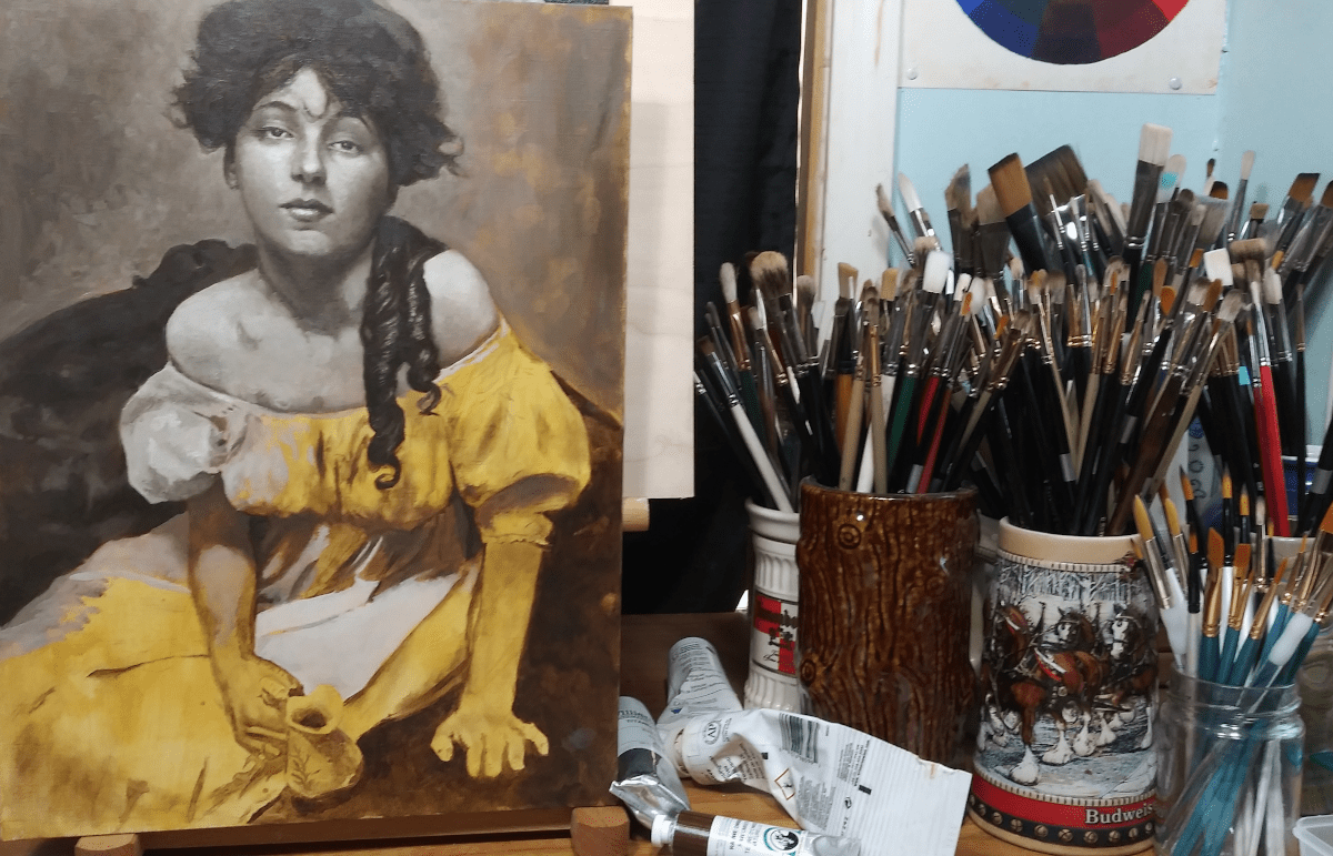
After the monochromatic “block in” has been established, and I’m feeling confident with the overall design; a balanced composition, sound drawing, accurate proportions, dynamic and defined lights and darks, it’s time to go in with color. It’s a good idea to start with your darkest darks, laying them down with a sense of simplicity and boldness – also, try to mass in your dark shapes and shadows with relatively thin paint, avoiding texture in the brushstrokes, as this can help convey a feeling of atmosphere, depth, and mystery to your painting. Save your thicker applications and textural impasto’s for the lights and highlights. As you progress
through your painting, try to work your way up the value scale; from the darkness and into the light. It is not a painless discipline, and there will naturally be a push and pull, a going of backward and forward, and backwards again. But the more you practice, the easier it becomes, and your painting skills will improve significantly.
“Value does all the work and color gets all the credit.” Ever heard that line? It is an axiom I very much subscribe to. However, let’s give credit where it is due. When it comes to painting, color is the frosting on the cake that makes the cake look yummy. Color is indicative of so much regarding our perceptions of existence, the way our brains work, and the infinite variables of how we see, understand and contextualize form, atmosphere, planar changes, material composition and density, transparency and opacity, perspective, textural dynamics, environmental conditions, psychological mood and feelings, memory… much like smell, color can signal an invitation, or a warning against danger.
There’s a lot to discuss about color… and the weeds are so very, very deep. As it applies to oil painting, my suggestion is to keep it simple. I recommend a kind of split primary palette, a warm and cool of the 3 primaries, plus three of my favorite secondary colors – you don’t need them, but they can be useful shortcuts. Also, I like to use 3 distinct dark colors, all of which fundamentally constitute a highly desaturated, low chroma version of the 3 primary colors.
As children we all have an inherent ability and predisposition, perhaps instinct, to draw and create images without shame or judgment As we get older, and self awareness takes hold we learn that a drawing can be “bad” and many of us simply stop. But It needn’t be this way, and I would encourage anyone interested in art, to just go for it. Do not be afraid of failure, as it is an inevitable and necessary factor in the artists’ journey. I believe that the continued practice of drawing and painting will produce lifelong benefits, aiding in mental health and can help open our eyes to the rhythms of nature, the mysteries of perception, and the inspirations that emanate from within – the inner vision that beckons to be expressed.
Ryan Embry can be reached at: [email protected]