SAMUEL SHELTON DESCRIBES HIS PROCESS
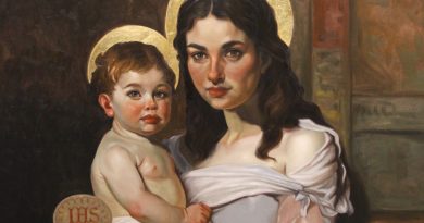
Here is a remarkable new painting by the artist Samuel Shelton!
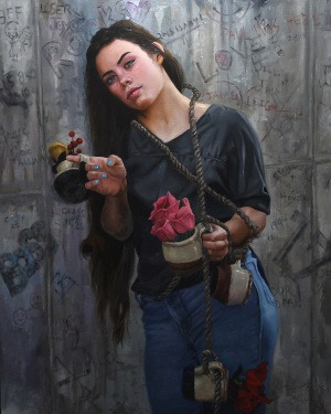
The Gift Giver is 24×30 oil on panel using colours from The Tree House.
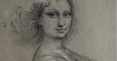
“I started with a detailed drawing on a traditional hide glue gessoed panel. I then started from the bottom of the figure and painted very tight from the get go with small round brushes. I worked my way up the figure and background inch by inch. I went for a finished product right off the bat because it is due into a major show and I had a deadline to meet.
Colors used: For the hair it is primarily Van Dyke, with lighter sections comprised of Burnt Umber, Raw Sienna and Burnt Sienna. The shirt is done entirely with Mars Black and white with the deepest black parts being done in Ivory black. The Mars black is a great color for producing more neutral grays and blacks that are not as intense as Ivory. The rope was done in varying earth colors, as were the jars. The flowers required getting into Rubine Red, Quin Magenta and 254. The golden flower at the top was rendered in Raw Sienna, Yellow Ocher, and Raw Umber.Raw sienna has a beautiful gold hue that is different from most other Siennas I have tried which tends toward a green shade. This will be a staple on my palette from now on.
The skin: I love earth colors and use them excessively in skin tones. Venice Red with black and white are enough to get nearly every purple hue on Caucasian skin. Venice Red and white gave the lovely rose color to her cheeks. Burnt umber and Burnt sienna made beautiful transitions into the deep shadows of Van Dyke, Burnt Umber and Mars Black. The lightest sections are combinations of Yellow Ocher, Raw Sienna and White.But the color I really want to praise is Ultramarine Violet. I mixed this into both dark and lights to act as muting agent for colors that were too chromatic. This mixed with Burnt Sienna and white makes fabulous mid tone skin color. Ultra Violet mixed with the yellow earths makes a lovely neutral transition color going into bright ocher and white areas, like on the clavicle/sterno mastoid area. Lastly I mixed this with Trans Oxide Red (another workhorse jewel of a color) and glazed this over the dried blue of the pants to deepen and desaturate the blue. Truly a workhorse purple.”
Samuel’s website in case anyone wants to view more of his work: www.tableofsixstudio.com